Showing posts with label Cover Art. Show all posts

The Signature of Civilisations

"Art is the signature of civilisations" - Beverly Sills

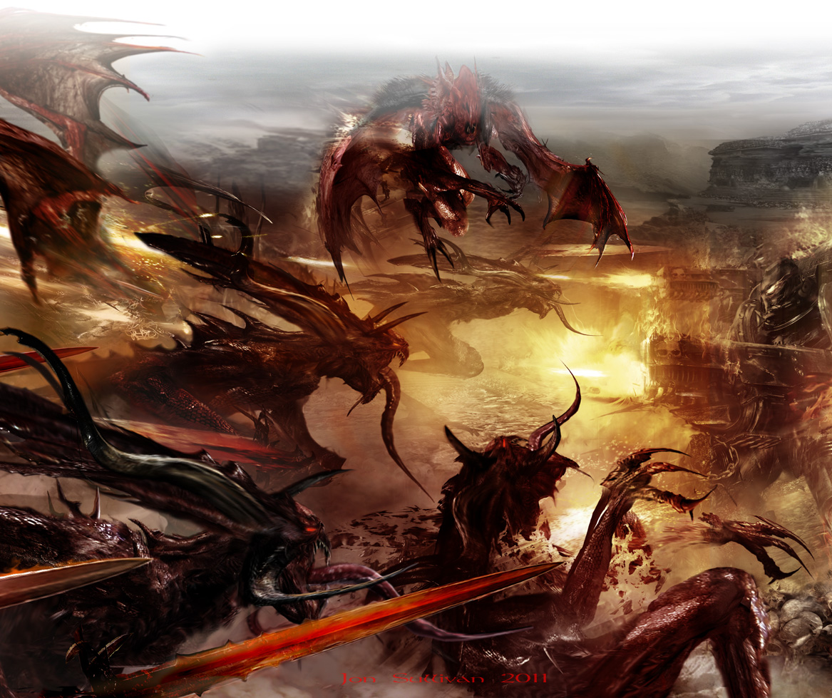
Words are really my business but great Black Library artists like Jon Sullivan, Stefan Kopinski and Neil Roberts are magnificent ambassadors for Warhammer and Warhammer 40k writers. There's a great deal of creative work on the internet relating to the Warhammer universes, and although not legitimate in the same way as a Games Workshop commissioned piece of art for a novel front cover or a codex, these pieces of art a wonderful in both their skill and variety. I'm not above admitting that I often use them here on the blog to illustrate the content of my posts. I've decided that it's not really fair to do this without appropriate recognition. I've therefore dedicated the bottom section of the blog to the original pieces of art that I use as a mini showcase, with the artist's name when I can track it down. If you would like to see more of their work then a swift internet search on Google or the excellent Deviantart site should do the trick.

On a similar theme I was sorry to see that Star Wars concept artist Ralph McQuarrie died earlier this month. I loved his concept pieces for Star Wars, The Empire Strikes Back and Return of the Jedi and remember seeing them first as a child. The pictures speak for themselves. R.I.P. Ralph McQuarrie.


As a bonus, here is another atmospheric Ralph McQuarrie piece, but it is not concept art for the Star Wars films identified above. Extra brownie points for those who know where it is actually from. Something else from my youth.

Visions of Damnation

One of the aspects of writing for Black Library that I especially like is working with other creative people. For my money, editors are the unsung heroes of the publishing process but it’s good for an author to remember there are a whole host of creative people who work hard to ensure that a piece of published fiction is a success. The people right at the vanguard of the whole process are the front cover artists and I particularly like working with them. There is something pretty magical about sending an artist narrative background material and samples of text and then - some time later - seeing that material interpreted in a piece of artistically-rendered genius. This process works in reverse, of course, when writers look to pieces of art for inspiration. The reason why artists are at the vanguard of the publishing process is because - beyond the text title - the front cover artwork prompts the readers’ first emotional reaction to the text. This happens on the bookshop shelf and also on the internet. The front cover art is the ambassador for the text, setting a tone and working hard to create initial interest and expectation.

On this blog I have spoken about the fantastic work of Stefan Kopinski. Stefan was responsible for Atlas Infernal’s atmospheric and evocative front cover. Stefan really tapped into the novel’s ‘Eye-of-Terror’ dark insanity. He also effectively gave Czevak his official 'face'. I talk a little more about Stefan and his work here and his website can be found here. Jon Sullivan worked on the cover for my first novel, Redemption Corps. Jon was spot on with the material I supplied at the same time as conveying the raw, indomitability behind Major Mortensen’s every word and action. I really feel for artists, however, when the reader misses out on the full glory of their work. Often a piece of art is significantly cropped in order to serve the needs of the cover. This is often necessary but still sad. Here, for instance is Jon’s uncropped piece of art for Redemption Corps and here is Stefan's for Atlas Infernal. Even if you own the novels (and I hope you do) the imaginative detail and skill are certainly worth a second look.

Jon Sullivan produces the artwork for the covers of the Space Marine Battles series and always does a brilliant job. His website can be found here. I was lucky enough to be working with Jon again on Legion of the Damned. He excelled himself again, rendering the accursed crusaders of the Damned Legion in glorious spectre-colour (rather than Technicolor) detail. There are several elements to admire in the full artwork for the cover. Legion of the Damned takes place on the cemetery world of Certus-Minor, and Jon did a great job of representing the dour, funereal stone of the landscape and distant city. The invading force of the Cholercaust Blood Crusade numbers innumerable Khornate cultists, Traitor Space Marines and monstrous daemons, is represented in Jon’s artwork by an attacking horde of willowy, vicious Bloodletters and Furies. The Legion of the Damned are obviously the centrepiece of the artwork and cover. I adore what Jon has done with these spectral warriors. They must appear brutally corporal at the same time as otherworldly and ethereal. Firepower from the grave! Jon totally pulled this off. My favourite aspect of the piece is the golden flame with which each Damned Legionnaire is imbued. The representations here don’t really do the full piece of artwork justice. I invite you to examine it in its full glory here.


I think that it’s also appropriate to pay homage to some of the great amateur Warhammer 40K artwork on the internet. I am not above showcasing such talent on the blog and similarly respect the skill and imagination such work requires. Keep it coming!

Seven Days of Damnation: Day 1

Seven Days of Damnation: Day 2 - Game On!

Seven Days of Damnation: Day 3 - New Skin

Seven Days of Damnation: Day 4 - Damnation's Calling

Seven Days of Damnation: Day 6 - Legion of the Damned Extract

Interview - Phonics and Phrenology

Two further questions and answers from my aforementioned author interview.Enjoy!

6) Silly question: The cover art of your first novel, Redemption Corps, portrayed the hero as bald. Now the cover art of your second novel similarly suggests a certain deficiency in the hair department on the part of your second major heroic character. What’s going on with that?

Ha! No conspiracy. Bald men are not taking over the future. This all comes down to the way in which the artwork for novel covers is commissioned. The publisher sends a brief out to an artist for the cover of a novel. I’m asked to write a section of that brief with advice, information and extracts from the work in progress to guide the artist. They work closely with the brief but are ‘artists’ in their own right and so the execution of the cover illustration is down to them. An artist called Jon Sullivan did my cover for Redemption Corps and Stef Kopinski did Atlas Infernal. Both artists did a fantastic job. I will be working with Jon again on the cover for my third novel, Legion of the Damned and hope Stef will produce the cover for any future Czevak novels. As for the baldness, I’m responsible for Major Mortensen’s – it’s part of his character’s back story. As for Czevak, his hair (or lack of) never came up as a significant issue in the novel and therefore is not part of the brief. I think that since Czevak is such an intellectual heavyweight in the novel, perhaps Stef decided to flag this with a Professor X / Mace Windu-style dome. What can I say: it suits him.

7) For the record, how do you (each reader will no doubt have their own ideas on the matter!) pronounce Czevak? See-vak? Zee-vak? Zeh-vak? Or some other way?

You are, of course, correct: it doesn’t matter how the reader specifically pronounces the name. It will not interfere with their enjoyment of the novel. I have heard several different pronunciations – for example a ‘ch’ sound at the beginning – like Czech. The 40k galaxy is broad and wide, however, with a good deal of room for diversity and interpretation. I personally interpret the name phonetically as ‘Zeh-vak’. It has a Slavic, no-nonsense feel to it while at the same time being suggestive of someone unusual and possibly exotic with the silent ‘c’. Even the ‘z’ sound that leads the pronunciation has a rare, superlative quality: there’s only one ‘z’ tile in Scrabble and it is worth 10 points! The ‘v’ and the ‘k’ produce a harsh, angular and ultimately satisfying resonance that lingers after the name. This degree of forethought might seem unnecessary but names are important to writers because they are important to readers. Gaz is the apprentice to an electrician, whereas Sebastian lectures in the Classics at Cambridge. If the names were reversed, then Gaz the Latin lecturer or Sebastian the ‘Sparky’ might strike people as unusual enough to pause and comment on in real life. If the names were reversed in a novel then such a detail might actually threaten the reader’s wilful suspension of disbelief and therefore their enjoyment of the text. Czevak’s name is unusual and therefore attracted my attention. If he had been called, I don’t know - Rob Sanders -then I doubt I would have written about him at all!

A Thousand Words

They say that a picture is worth a thousand words, so I’ll go easy on the old lexis and let the images do the talking. This is the cover art work for my novel Atlas Infernal by the excellent Stef Kopinski. You can enjoy more of his stunning work here. This is the full, un-cropped illustration without the design features and title. In the piece we get to see Inquisitor Bronislaw Czevak getting to grips with a daemon world denizen. Click on the image to see more of its warped and gorgeous detail.